The Gavias Content Builder module ships with a number of pre-built 'elements' you can insert inside your columns. Some of these 'elements' come pre-designed with styling and their own scripts to produce some cool effects and functionality like the 'Carousel' element for example, or the 'Accordion' element (used in the FAQ page). You will, however, still need to type in your contents and with some of them specify some values depending on what the 'element' requires.
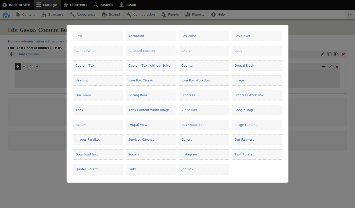
A menu of available elements you can use in your layout
We will only touch on the more essential content builder elements in this documentation but you can always explore the rest of the other elements on your own. These elements are fairly easy to work with and figure out.
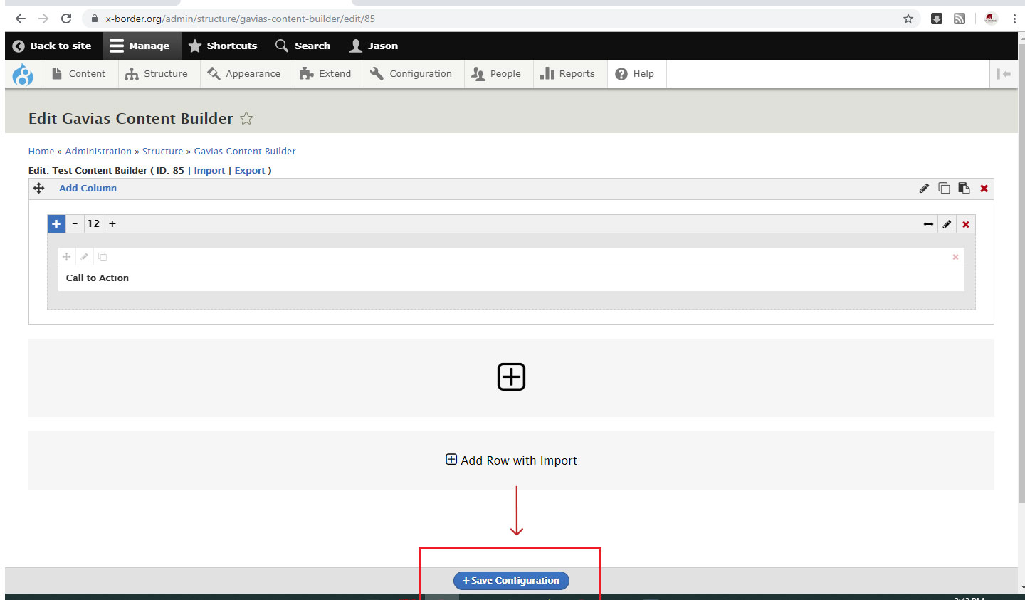
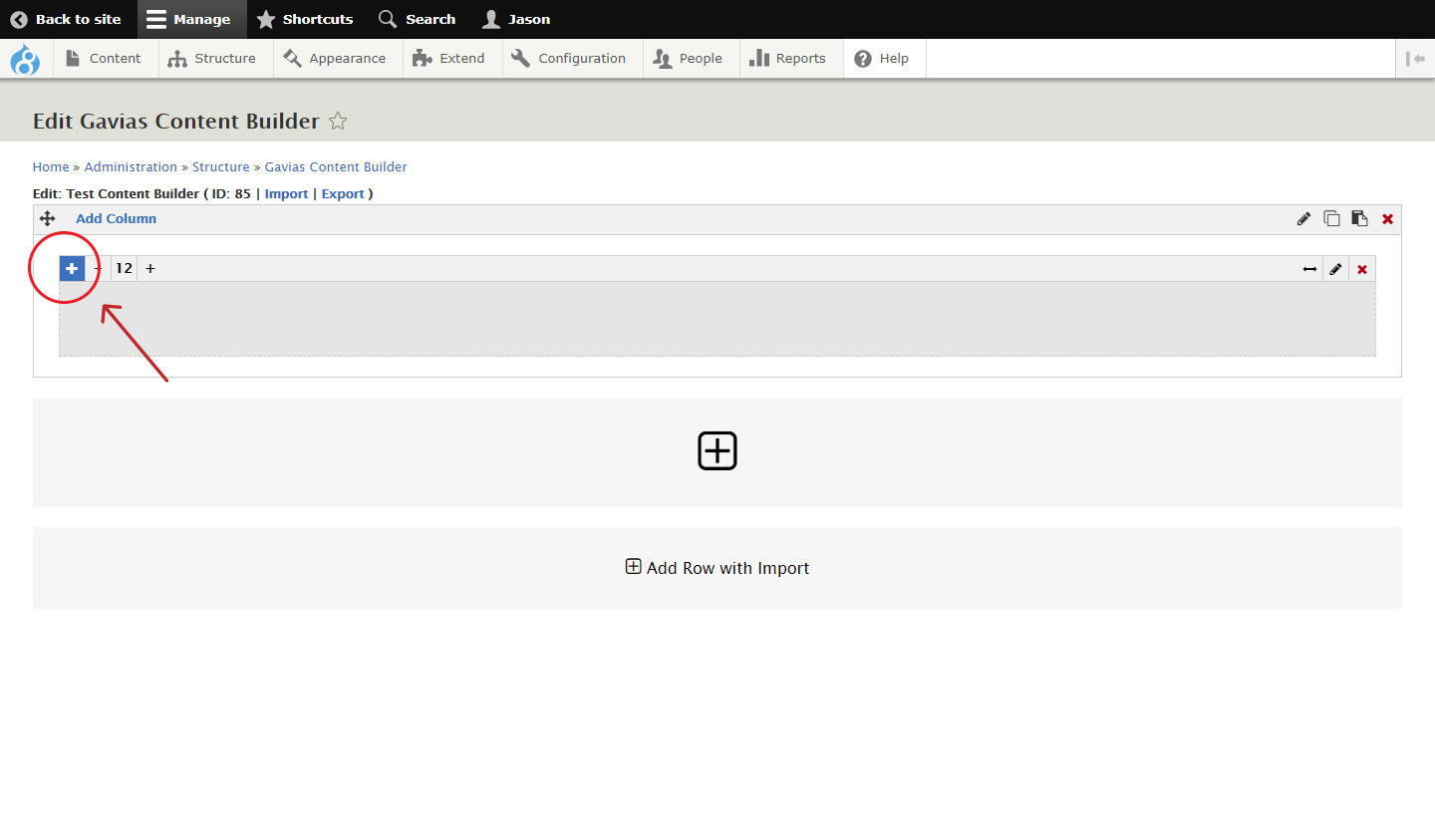
To add or put an 'element' inside a column, simply click on the plus icon on the top right corner of the column.
On the menu of elements that pops up, select the element you need and configure the element as prompted.
Commonly Used Content Builder Elements On the Site
Row
Use the 'row' element to 'nest' or insert a row inside yet another column. You can then produce some interesting layout as this makes possible nesting another set of columns inside any given column.
Custom Text
With 'custom text', you can place a body of text inside any given column. The element comes with a WYSIWYG text editor you can use if you are not comfortable writing HTML.
You may also work in 'source' mode if you don't mind writing text with HTML tags. Working in 'source' mode ensures text has clean HTML markup and no unnecessary HTML gets thrown into the mix.
To work in 'source' mode, click on 'Tools' from the editor tool palette and click on 'Source'.
Heading
Use the 'Heading' element if you need to insert titles or headings that come with configurable styling and some preset display e.g. font-size, font-weight, font-color, underline-style, etc.
You may refer to some of the posts on the site to see how this element is put into use.
Image
Use the 'image' element for inserting images. Once on the element's configuration pane, click on 'Open file browser' to either upload from your computer or insert an image that's already existing in your library.
We have designated the folder 'xb-uploads' for images that can fall on any page on the site, and the folder 'articles' for article-related images. Be sure to select the right folder when uploading images to maintain some organisation to our images.
It is also recommended to follow the prescribed images sizes (See Prescribed Image Sizes).
You may skip the rest of the element configuration.
Video Box
The 'Video Box' element presents a convenient way to insert videos. Select this element and configure as needed.
1. Fill out the Title field (for Admin referencing only)
2. On the 'data source' field, insert the video source. Below are the sources and corresponding sample url formats.
For Youtube, retrieve the url link from the browser address bar of the active Youtube video (not the one that you get from the Share link).
Example
Youtube : https://www.youtube.com/watch?v=XsN9NnD0tFY
For locally sourced video files, make sure the video is uploaded on the server, and you have the correct link path or file location path.
Example
Local source : /sites/default/files/rebuilding-homes-lives.mp4
3. The element allows uploading custom image preview. Upload from your computer or select from your library.
You may skip the rest of the element settings and you should be good.
Box Quote Text
Use 'Box Quote Text' to insert quotes or any textual content that you need to highlight. This element comes with a preset styling (See images).
Button
You can also insert some good looking buttons with the 'Button' element. The button appearance is configurable. You can, for example, specify the following...
- The button label (by filling out the Title field)
- Button size (Mini, Small, Medium, Large, Extra Large)
- Text color (use white #fff against dark background)
- Text color hover
- Border color
- Border color hover
- Background color (e.g. the X-border green #03a89e)
- Background color hover
- Border radius (if you want rounded corners)
Indicate the link url in the link field e.g. /disaster-relief-efforts-donation-form
Applicable to All
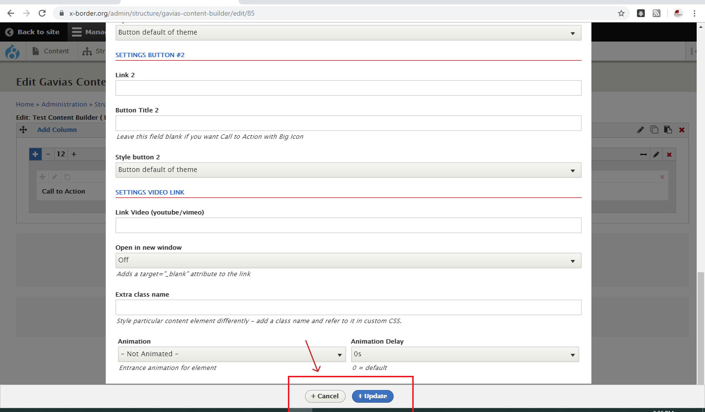
Click on either 'Cancel' or 'Update' to exit editing any content builder element.
Click on 'Save configuration' at the bottom of the page, to permanently save any changes on the layout.